
One bite-sized decision made Apple’s logo unmistakable. And decades of brand building packed it with meaning.
During a branding discussion a few days ago, I recalled a story about the Apple logo that sounded almost too tidy to be true.
Turns out, I remembered it correctly.
Apple’s original logo, designed in 1976 by co-founder Ronald Wayne, was an elaborate illustration of Isaac Newton sitting beneath an apple tree, surrounded by text.
It looked more like the frontispiece of an old book than the identity of a company preparing to sell personal computers.
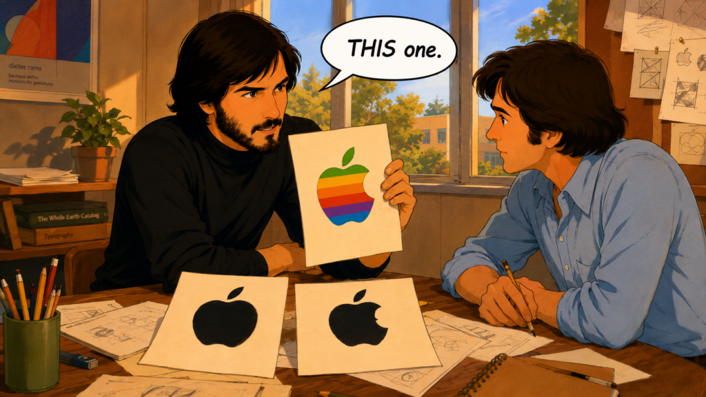
As Apple prepared to introduce the Apple II in 1977, art director Rob Janoff at Regis McKenna was asked to create something new.
Steve Jobs’ direction was wonderfully brief:
“Don’t make it cute.”
Janoff developed the simple apple silhouette we still recognize today.
And then came the bite.
In Walter Isaacson’s Steve Jobs, Janoff presented versions with and without it. The whole apple looked too much like a cherry, so Jobs chose the bitten version.
Janoff himself has explained the same idea slightly differently: the bite provided scale, ensuring people understood they were looking at an apple rather than a smaller round fruit.
That’s it.
One missing chunk made the entire symbol easier to understand.
The famous “byte” connection came later. Janoff says he didn’t even know the computer term when he designed it. His creative director pointed out the coincidence afterward.
The original six coloured stripes had a more deliberate technological purpose. They helped communicate one of the Apple II’s amazing new capabilities: colour graphics. They also made this intimidating new category of machine seem more approachable.
Apple eventually removed the rainbow colours. Landor refined the shape in the 1980s, making it more symmetrical and geometric. The materials, colours and treatments have changed repeatedly since.
The bitten silhouette survived.
And that’s the part I like best.
When I talk about visual identities (not just brands) people love, Apple goes near the top of the list. People covet that symbol.
A plain Apple logo on a laptop lid or the back of a phone communicates an extraordinary amount.
It carries decades of products, advertising, design decisions, launches, stores, packaging and customer experiences.
The symbol itself is incredibly simple.
What customers have learned to associate with it is enormous.
I write in I Need That about the meaning customers attach to products, because we never encounter products as collections of specifications alone. Brands become shortcuts to everything we already believe about what we’re looking at.
Apple’s logo might be one of the purest examples.
The bite originally helped us recognize an apple.
And nearly 50 years later, the apple helps us recognize an entire worldview about the product.
That distinction is useful when companies obsess over whether their own logo says enough.
A logo has one immediate job: be recognizable and ownable. (Sounds like two, but they’re inseparable in logo creation.)
Then the company spends years giving us reasons to feel something when we see it.
If you’d like help creating and marketing products people feel compelled to buy, the product marketing consultants at Graphos Product can help.