
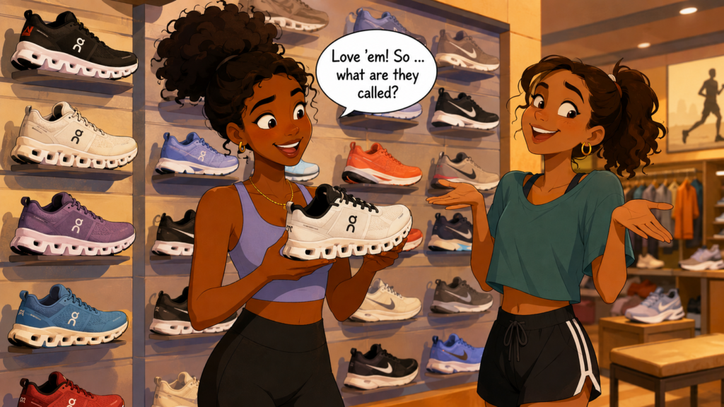
Great logos balance memorability with readability, and HOW your product is discovered changes how much each one matters.
I’ve been working with a client on a logo for an exciting new product, and we found ourselves debating a common and surprisingly nuanced question:
How important is readability?
That immediately made me think of On running shoes.
I’ve owned two pairs of shoes by the popular Swiss brand.
It wasn’t until the second pair that I found out the brand is called On.
Until then, I seriously wasn’t sure … and had guessed wrong.
The logo combines a stylized O with an N, but the O includes a small notch inspired by a power symbol, and the N is highly stylized. The result is distinctive, but many people (including me) read it as “QC,” “DQ,” or something else entirely.
The confusion is so widespread that searching Google for “QC shoes” or “DQ shoes” leads you to On anyway. (Give it a try!)
Ordinarily, I might consider this a problem. It takes time and presence to enlist Google’s help like that.
But context is huge.
If you’re shopping for snazzy running shoes, you’re usually standing in front of a wall of products.
The styling, colours, and overall design often do way more of the selling than the logo itself, and you just point to the shoe you want in your size.
Digital works differently, but still may not be a huge concern.
An online ad, a Google search result, or an Instagram post usually spells out the brand name.
Readability is less reliant on the logo because the surrounding content fills in the gaps for anyone who wants to know.
That’s an important distinction.
A logo doesn’t exist in isolation, but inside its own fully contextual buying experience.
This connects straight to I Need That. There‘s no universal formula for awesome branding. Every design decision should reflect how customers actually encounter (and will choose) the product.
Some categories reward instant readability. Others reward memorability, uniqueness, or visual intrigue.
On demonstrates that a logo doesn’t always have to be super readable for the brand to become enormously successful.
But I’d still urge you to be cautious.
When you’re introducing a completely new product, every ounce of recognition is hard-won.
Making people wonder what your name is can be a fun little game, with a nice dopamine reward if they guess right.
But if too many fail in too many places, it creates an obstacle between curiosity and purchase. Fewer sales, not good.
Want to make your product irresistible? That’s what we do as go-to-market consultants at Graphos Product, helping innovators turn need-driven ideas into market-ready successes.