
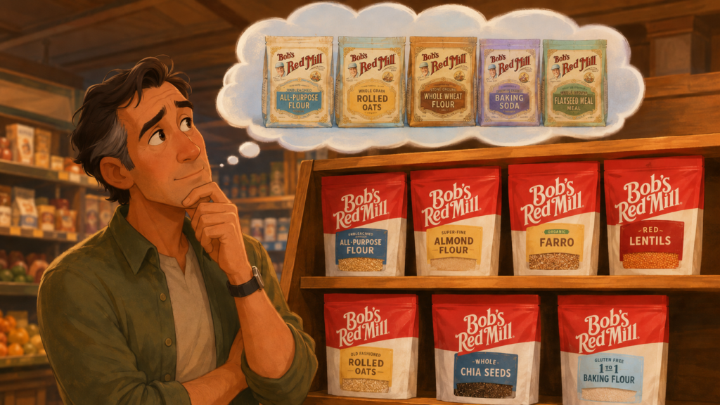
Packaging redesigns often reveal a deep question: what are customers REALLY attached to?
I’ve been buying Bob’s Red Mill products for decades.
And honestly, the old packaging had some issues.
The bags were visually chaotic. Different products used completely different colour palettes, and unless you already knew the brand well, finding the right product in-store could feel strangely difficult.
Some stores I go to would group Bob’s products together in a dedicated section, while others scattered them throughout the aisles based on category.
That created a navigation calamity.
If you wanted 10-grain cereal (my fave) or Bob’s almond flour, you first had to remember what colour the dang bag was.
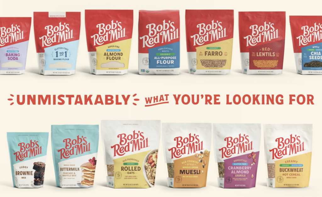
Image: Bob’s Red Mill
Even the name itself seemed harder for people to recall than it should have been.
“Bob’s Red Barn?”
“Red Knob?”
“Bob’s somethingorother…”
Ironically, the word “Bob’s” was visually much smaller than “Red Mill,” even though Bob Moore himself was the emotional anchor of the brand.
The redesign clearly tries to solve these issues.
Now the products are definitely unified:
Cleaner, easier to spot, easier to merchandise. And easier to extend across categories.
The new shelf presence is much stronger from a retail systems perspective.
I know exactly why the company did it.
But I totally get why longtime customers feel conflicted.
The old bags had eccentricity and warmth. They felt handmade, earnest, slightly crunchy, and unmistakably tied to Good ol’ Bob.
The redesign feels more contemporary and scalable, yes … BUT also more corporate and interchangeable.
That tension becomes even more emotional because Bob died only a couple of years ago.
His illustrated portrait, once central to the packaging, has largely been replaced by a small line-art seal tucked lower on the bag.
For many loyal customers, it feels less like a redesign and more like a sneaky shuffling-away of the founder’s presence.
This is the danger zone in heritage branding. We have plenty of Betty Crocker type options already.
Modernization solves operational problems while sometimes jettisoning emotional texture.
And emotional texture matters enormously in food brands because customers are often investing in something beyond basic ingredients.
Customers like Bob’s are shopping for trust, ritual, legacy, and familiarity.
The strongest redesigns succeed in preserving the original soul, so loyal customers still feel continuity through the change, while new ones are attracted to switch.
That’s freaking difficult work.
Especially when the founder himself was embedded in the product experience.
Want to make your product irresistible? That’s what we do as product marketing consultants at Graphos Product, helping innovators turn need-driven ideas into market-ready successes.