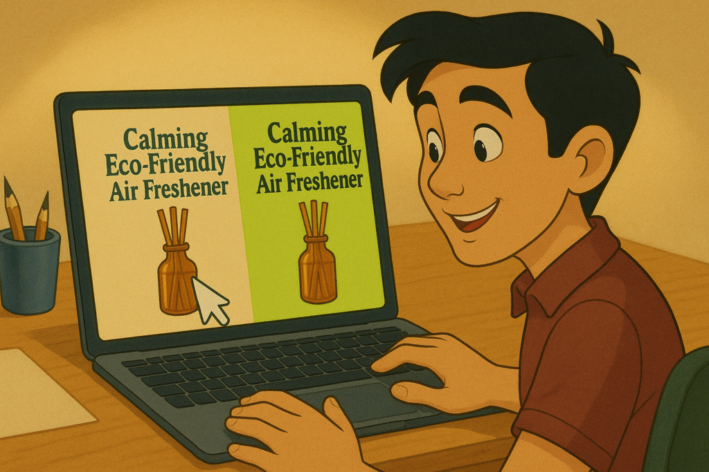
New research shows packaging colors shape expectations and purchase intent far beyond simple attention-grabbing hues.
Every junior marketer and design student knows the theory:
Green = eco or money
Red = urgency
purple = frustration
And then, here in the real world, we mostly design for impact and visual appeal.
We need it to “make it pop.”
Get clicks.
Convert.
But across multiple experiments, researchers found that when packaging colors fit the product’s story (not merely “pop,”) consumers rated brands more authentic and said they were more likely to buy.
Incongruent colors (like neon green for a calming cleaner) triggered skepticism instead of interest.
For you and me, that’s a cue to test not which color stands out most, but which color primes the right associations.
Packaging color becomes part of your brand’s promise, especially when you’re new and need instant credibility.
Want to make your product irresistible? That’s what we do as product marketing consultants at Graphos Product, helping innovators turn need-driven ideas into market-ready successes.
