Our brains like shortcuts.
Often when doing logo design projects, my team and the client’s get into a familiar discussion.
Should the logo attempt to represent the product?
Would doing so be too limiting or on-the-nose?
And depending on the nature of the product, is it even feasible to try?
Well, here’s what we know, based on science:
Researchers ran seven experiments with over 4,000 people and found something pretty cool:
When a logo visually hints at the product or service: a tree for a gardener (a shoe for a shoe store) people rated the brand up to 27.7% more authentic and 18.7% more positive, and said they were more likely to buy from 174 real UK startups tested.
The effect was even stronger for new or unfamiliar brands, BUT flipped to the negative for less palatable products like lice shampoo.
This isn’t an argument against simple marks.
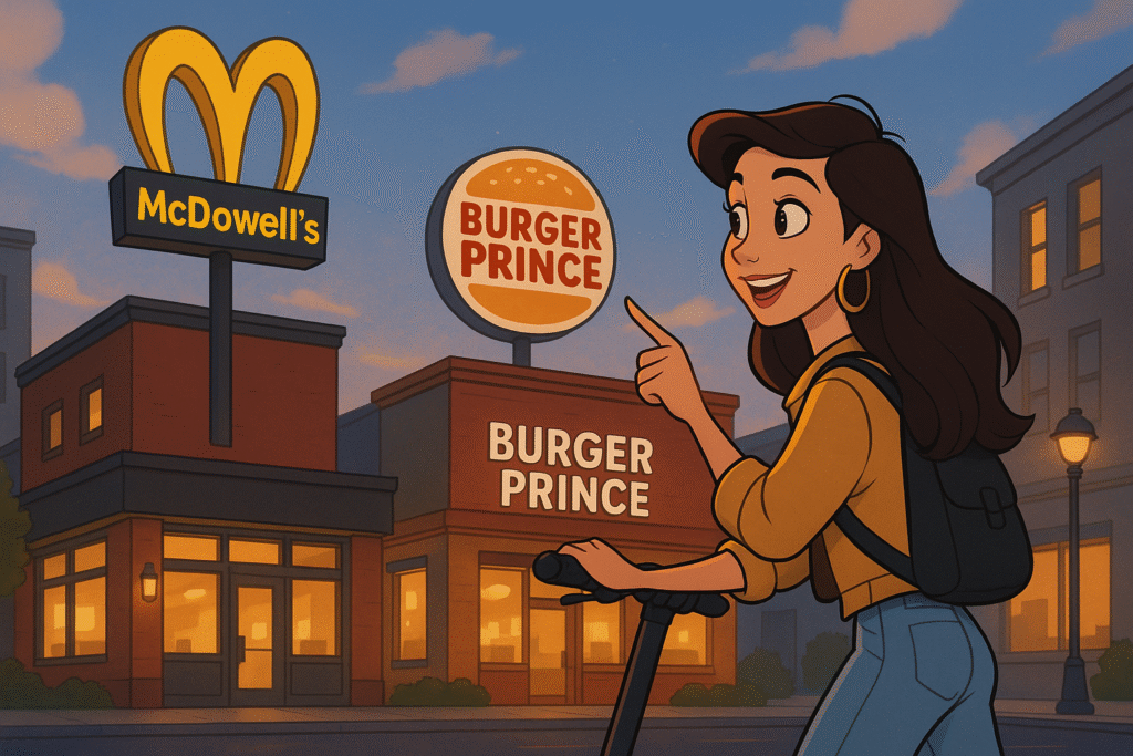
Starbucks and McDonald’s can get away with abstraction because their brands are already famous.
Absolutely no one is choosing where to eat or sip based on the logo, clueless about what these businesses sell.
But if you’re new, a more abstract logo asks your prospects to work a little harder.
(Which they DON’T tend to do.)
A clear visual cue acts like a cognitive hand-rail for the “dog brain,” our instinctive, low-effort processing.
So buyers warm up faster.
For small makers, that means your logo can quietly prime authenticity and purchase intent before anyone reads your name.
If you’re a new brand, consider testing a logo that gives at least a subtle nod to what you offer, even if you plan to simplify later once recognition is earned.
Not saying it’s the right choice for every brand. May not be.
But if it fits, doing so can give you an edge.
Want to make your product irresistible? That’s what we do as product marketing consultants at Graphos Product, helping innovators turn need-driven ideas into market-ready successes.
